TYPOGRAPHY CHOICES THAT MAKE OR BREAK A BRAND
Typography carries more of a brand's personality than most people realize. The right typeface builds trust before anyone reads a word — the wrong one undermines it just as fast.
Author
READ
Category

Every typeface carries a personality, whether it's intentional or not. A sharp geometric sans feels confident and modern. A classic serif feels established and trustworthy. A rounded, friendly typeface feels approachable and casual. None of these are better or worse — they're simply saying different things before a single word has even been read.
This is why picking a typeface off a trending list rarely works. The question isn't "what looks nice" — it's "what does this brand need to sound like." A financial services brand and a children's toy brand should never reach for the same typeface, even if both look polished in isolation. Type has to match the voice, not just the visual trend.
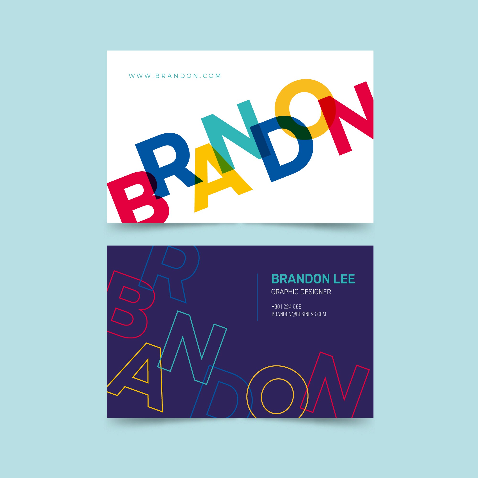

A strong typographic system isn't just about picking one good typeface — it's about establishing a clear hierarchy: what's a headline, what's a subhead, what's body copy, and how each of those relates in size, weight, and spacing. Without that structure, even a beautiful typeface ends up feeling flat, because everything competes for attention at once.
Good hierarchy does the reader's thinking for them. It guides the eye to what matters first, second, and third, without anyone having to consciously figure out where to look. When hierarchy is missing, people don't just find the layout harder to read — they subconsciously read the whole brand as less considered.

One of the fastest ways to weaken a brand's typography is using too many typefaces at once. Two, sometimes three, is usually the ceiling for a cohesive system — a display face for headlines, a clean workhorse for body copy, maybe a supporting accent for small details. Beyond that, the system starts to feel disorganized rather than expressive.
The brands with the strongest typographic identities are rarely the ones with the most unique or elaborate typefaces. They're the ones that picked something with real character, then applied it with total consistency everywhere — down to the exact weights, sizes, and spacing used across every touchpoint. Consistency is what turns a typeface choice into a recognizable brand asset.


