COLOR THEORY FOR BRAND IDENTITY
Color is often the first thing a brand communicates, and the last thing people forget. Here's how thoughtful color choices shape perception before a single word is read.
Author
READ
Category

Before someone reads a tagline or scrolls a homepage, they've already reacted to a brand's color palette. Deep navy reads differently than warm terracotta. A muted sage feels different from a saturated red. This reaction happens almost instantly, shaped by a mix of cultural association, contrast, and instinct — long before logic gets involved.
This is why color can't be chosen last, or picked simply because a founder likes a certain shade. It has to be chosen deliberately, based on what the brand needs people to feel in that first half-second: trustworthy, energetic, premium, approachable. Get that first impression wrong, and everything built on top of it has to work twice as hard.
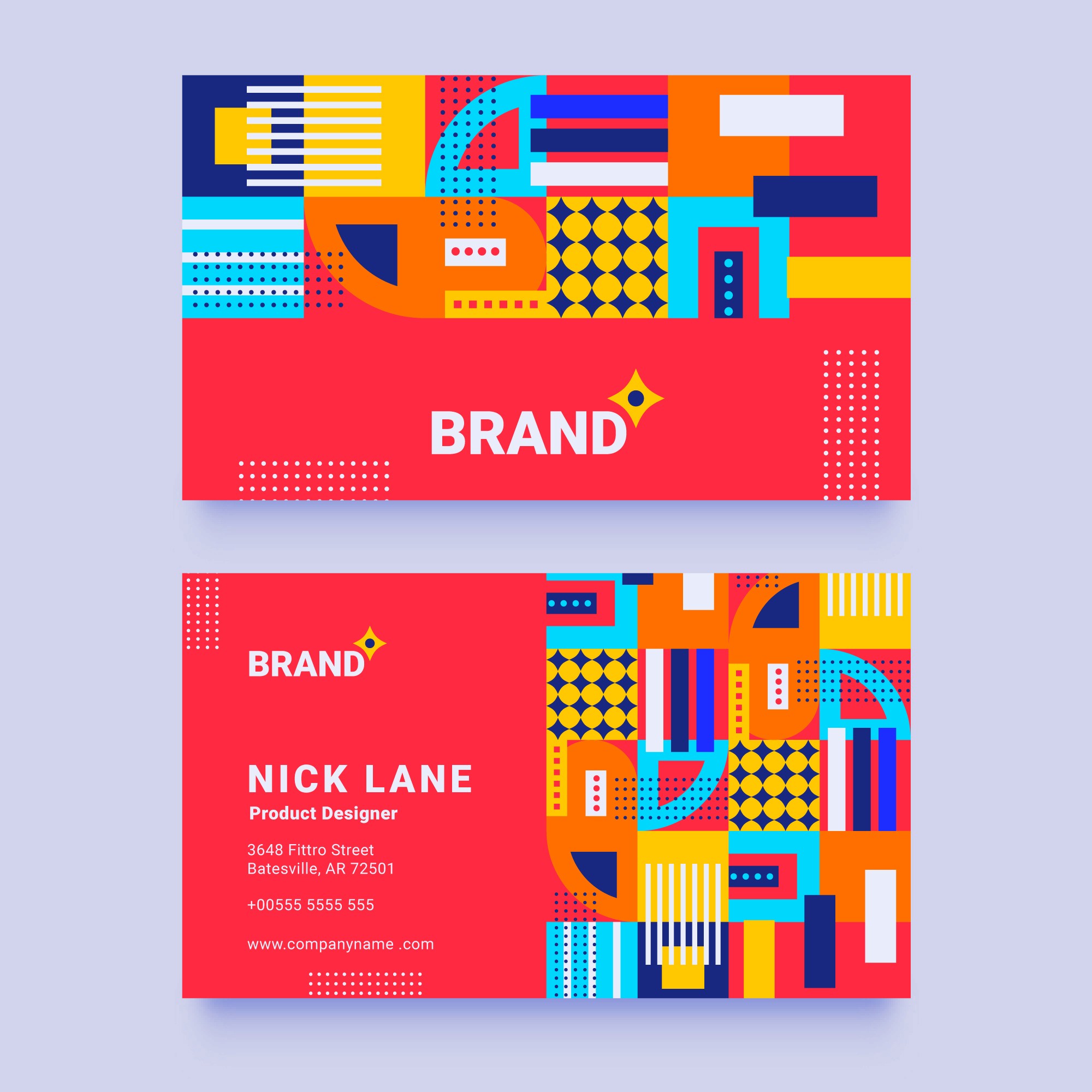
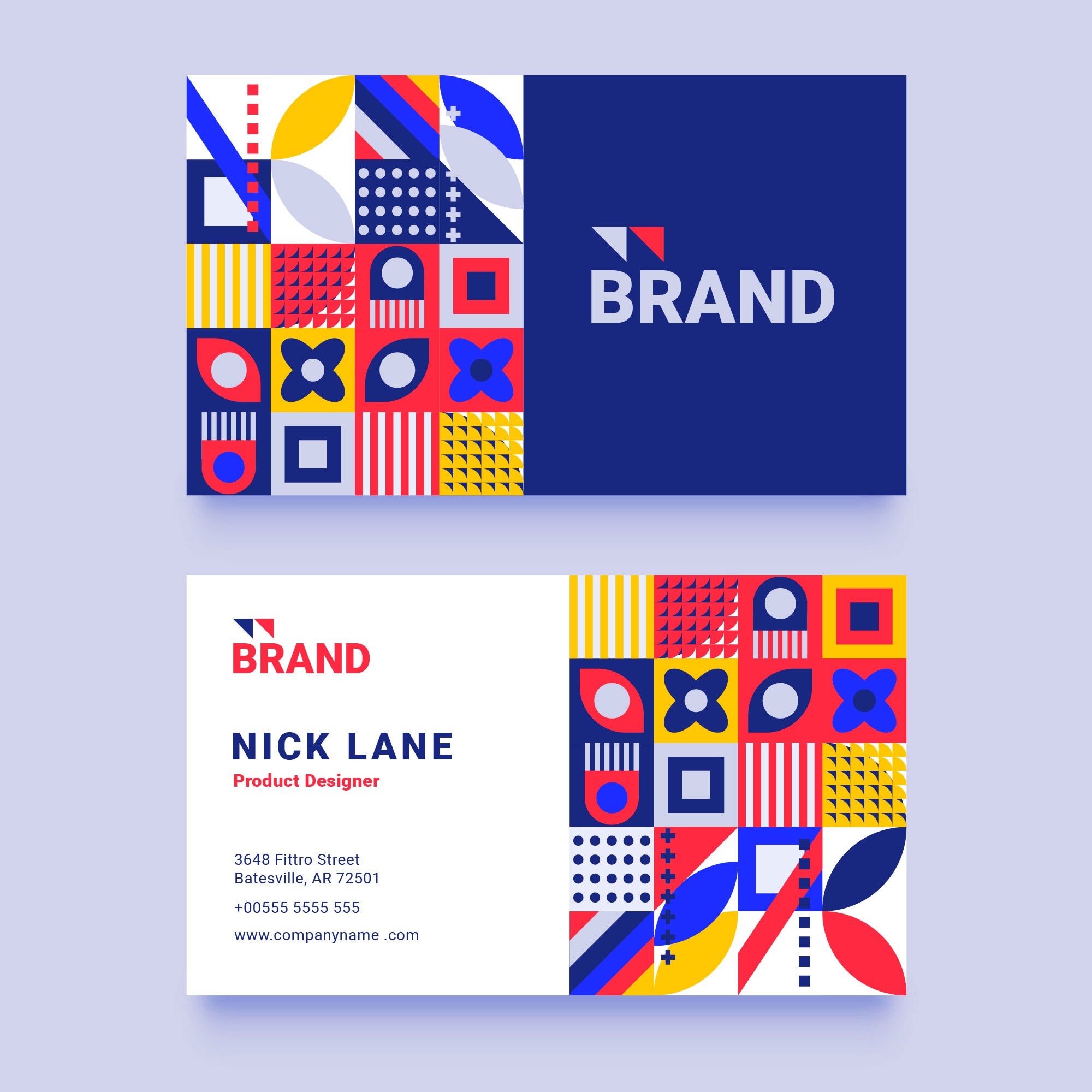
One of the most common mistakes in early-stage branding is using too many colors without a clear hierarchy. A tight, intentional palette — usually one or two primary colors plus a couple of supporting neutrals — reads as considered. A palette with five competing colors and no clear priority usually reads as indecisive, even if each individual color looks fine on its own.
Restraint here isn't a limitation, it's what makes a brand recognizable. Repetition builds recognition, and repetition only works if the same colors show up the same way, every time — on the website, the packaging, the social templates, the signage. A color system with too much variety never gets the chance to become memorable.

The same color can mean different things depending on culture, industry, and context. A green that feels natural and organic for a wellness brand can feel completely wrong for a finance brand, where it might instead signal something closer to money or growth. There's no universally "right" color — only the right color for a specific brand, audience, and category.
This is why color decisions should always come after strategy, not before. Understanding who the brand is speaking to, what shelf or space it needs to stand out on, and what its competitors already look like should inform the palette — not a personal favorite color or a trend pulled from a moodboard. The best color systems feel inevitable in hindsight, because they were built around a clear reason, not a guess.


