Year
2025
Client
KATIE PEARSON
Category
PHOTOGRAPHY
Product Duration
3 - 4 Weeks
The CrunchMorn portfolio project explores the energy of a great morning — playful, colorful, and full of character. Research includes studying cereal packaging trends, understanding what makes shoppers pick one box over another, and analyzing how color and typography drive appetite and recognition on shelf.
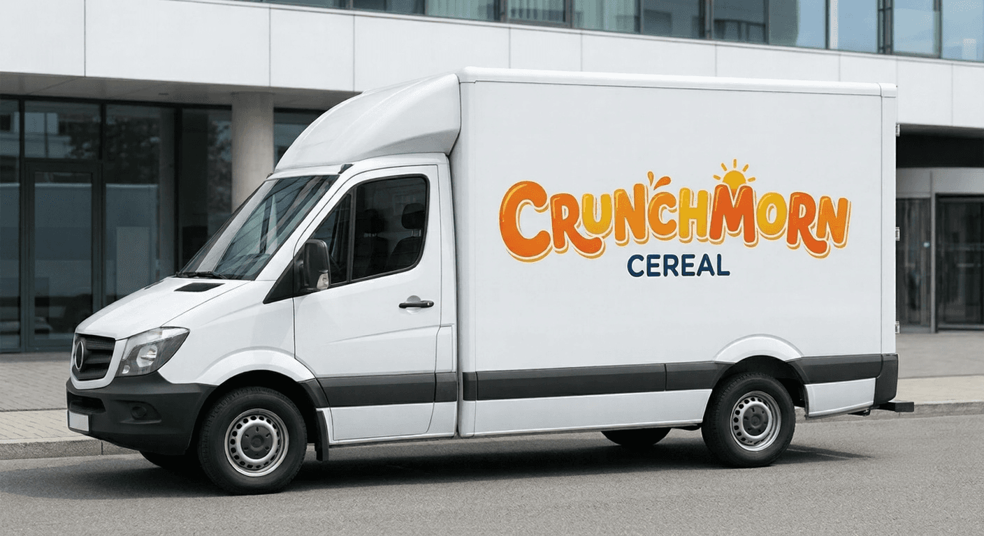
With vibrant color, bold typography, and a friendly, energetic visual language, the identity is built to grab attention and feel instantly craveable. Every element — from the logo to the packaging — is designed to make CrunchMorn feel fun, familiar, and impossible to scroll past.

The design integrates a cohesive visual system across packaging, logo lockups, and supporting brand assets to bring CrunchMorn to life. From shelf-ready box designs to a flexible identity that scales across future flavors, the brand system gives CrunchMorn a consistent, recognizable presence everywhere it shows up.

Every element of the CrunchMorn identity tells a story — from a bowl of cereal to a burst of morning energy. The system focuses on color, character, and craveability, offering a bold visual experience for anyone who wants their morning to start with a little more fun.