Year
2023
Client
David Piagure
Category
TECH & INFORMATION
Product Duration
3 - 4 Weeks
The KŌDO portfolio project explores the discipline behind Japanese design philosophy — restraint, intention, and precision. Research includes studying minimalist tech branding, understanding how Japanese typographic tradition (the macron, the balance of negative space) can inform a modern wordmark, and analyzing how global tech brands signal trust through simplicity.
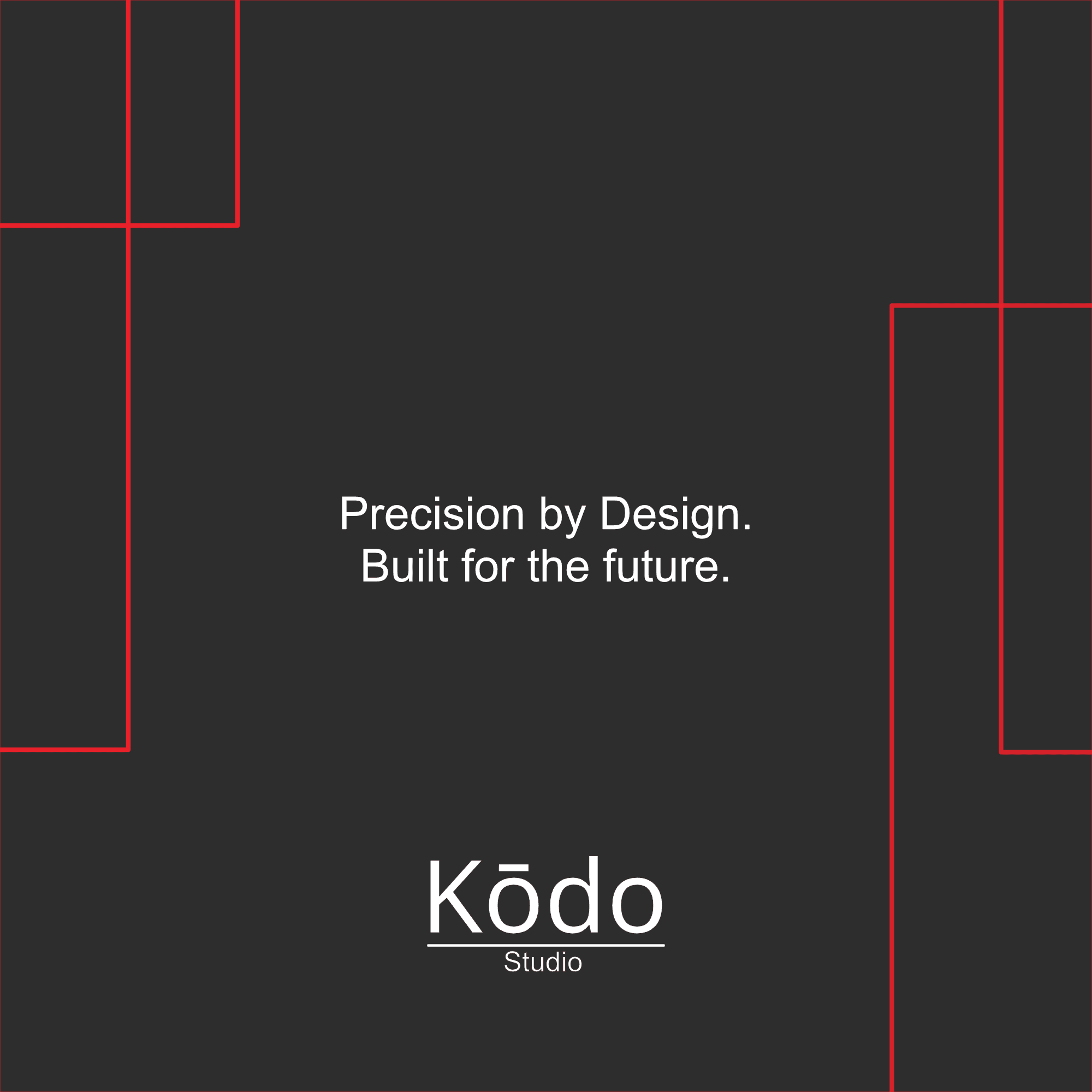
With a clean serif-meets-sans wordmark, a stark black-and-white palette, and generous negative space, the identity is built to feel confident without shouting. The underlined "Studio" lockup grounds the mark, while the long vowel mark over the "ō" keeps the name's meaning — sound, movement — quietly present in every application.

The design integrates a flexible identity system across digital and physical touchpoints — from device screens and signage to print collateral and repeating brand patterns — to bring KŌDO to life anywhere the brand shows up. The monochrome system scales cleanly from a phone screen to a storefront sign without losing its precision.

Every element of the KŌDO identity reflects its name — a Japanese word tied to sound, rhythm, and motion. The system centers on stillness and clarity, offering a brand experience for a tech company that believes the best technology gets out of the way and lets the idea speak.